Best drive these cars with your eyes closed.
Your car’s interior is where you’ll be spending most of your time. It’s a place that should spark joy in your heart and put a smile on your face every time you open the doors and enter it.
Like your garden or your bedroom or your favourite restaurant, the inside of your car should be a place you can enjoy being in. A place you are proud to call your own.
That’s why we would strongly recommend only buying these cars if you’re capable of getting from A to B whilst avoiding eye contact with your dashboard like it’s a driver next to you at a set of traffic lights.
Renault Zoe
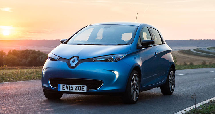
If you’re buying a Zoe, be sure to buy the 2020 facelift model because before that, the interior of this car was…pretty bad.
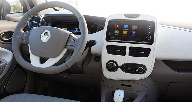
The new facelift model looks very nice on the inside but the same cannot be said for anything before that. With a screen that has icons big enough for the car behind to read that’s surrounded by glossy plastic with rounded edges, the centre console has ended up looking like a child’s toy. Did Renault collaborate with Playmobil on this one?
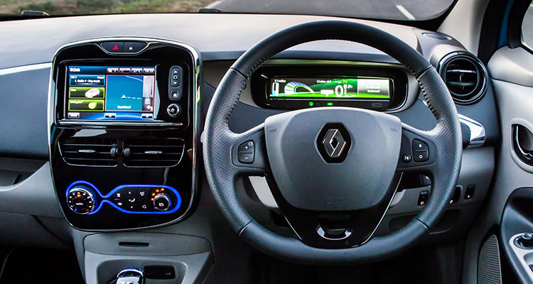
It doesn’t look quite as bad in black but it still feels like you’re inside one of those red and yellow cars for children you see in shopping centres.
Aston Martin Vantage
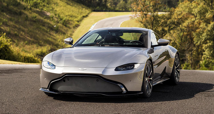
Although the Vantage is Aston Martin’s cheapest model, it’s still incredibly gorgeous and also still costs £120,000. Despite it belonging to Britain’s coolest car manufacturer, it isn’t so cool once you’re inside.
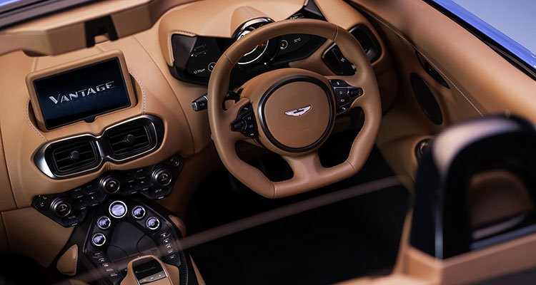
It’s almost like the air vents are the centrepiece of the car? Very odd. And all of those circular buttons clustered around each other is oddly disturbing. It may not be full of plastic but at the same time, you can’t just expect an interior to look nice just because it’s made of nice materials. Weird vents that look like eyes and about a million buttons certainly does not equal a good time!
Tesla Model 3
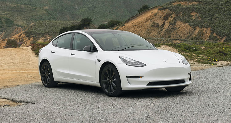
The Model 3 is a truly polarising car. Some hate it, some love it. My question is, how can one say that they love the interior of the Model 3 when it doesn’t even have one?
They got rid of the vents (which is fine, most vents are ugly), they got rid of all the buttons and they even got rid of the gauge cluster!
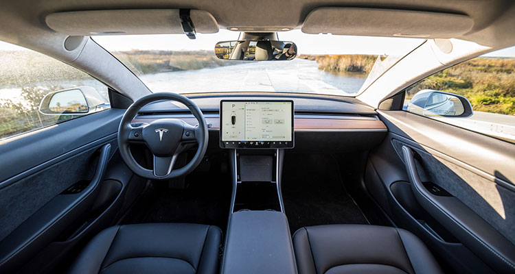
The inside of a Model 3 is a desolate and empty place with nothing but a hideous steering wheel and one large screen. It’s dull, it’s boring and it’s cold. Only extreme minimalists and serial killers will enjoy this interior.
Mercedes A-Class
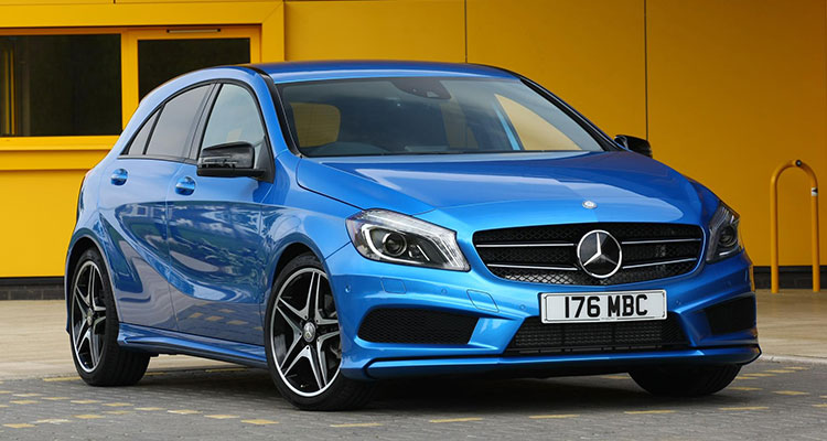
Before the new shape came along, the A-Class had a pretty terrible interior. In 2013, when it launched, it was acceptable. However, as time went on and screen become more and more commonplace in cars, the A-Class’s centre console became more and more ugly.
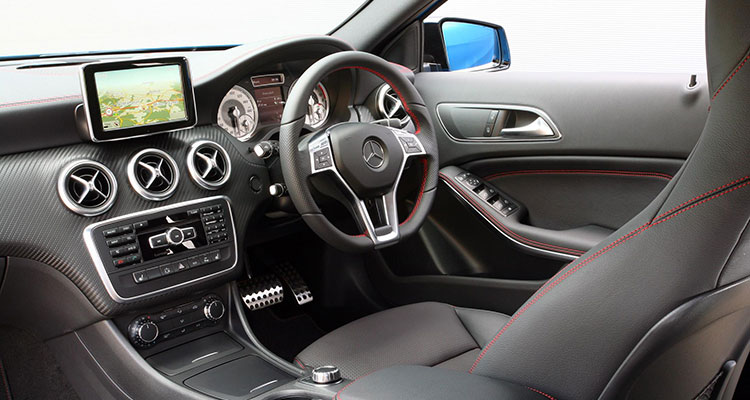
The bezel on that screen is unforgivable. Not only is it about an inch thick, but also it’s rounded! Not only that, but the buttons below it are a whole new crime of their own. Why would a number pad be in a luxury car released in 2013? It’s like we’re back in the 80s again. I’m surprised they didn’t include an option for a corded carphone to go with it.
Kia Picanto
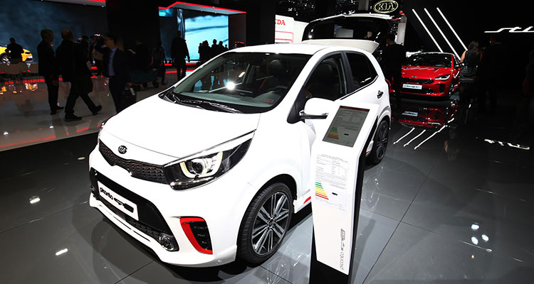
If you buy any Picanto that has a model year before 2017, you’ll unfortunately have to live with the awful interior that it once had.
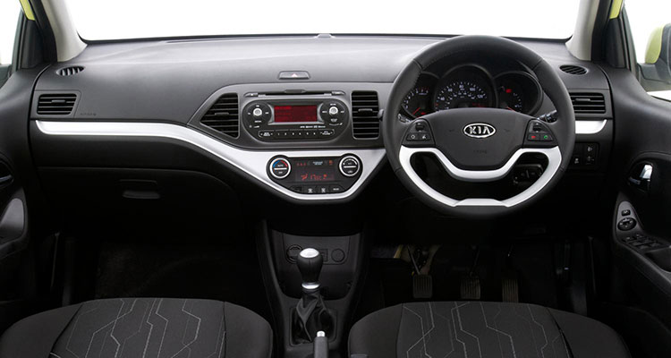
A 2-spoke dual-tone steering wheel and a centre console that’s best forgotten is what you’ll find inside a used Kia Picanto. It may not be as offensive as some other cars but it’s still an interior best forgotten. Of course, that won’t be a problem as the whole inside of the car is best described as ‘forgettable’.
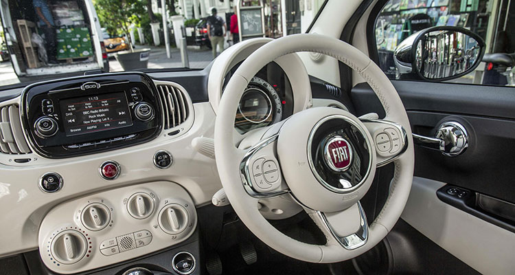
Fiat 500
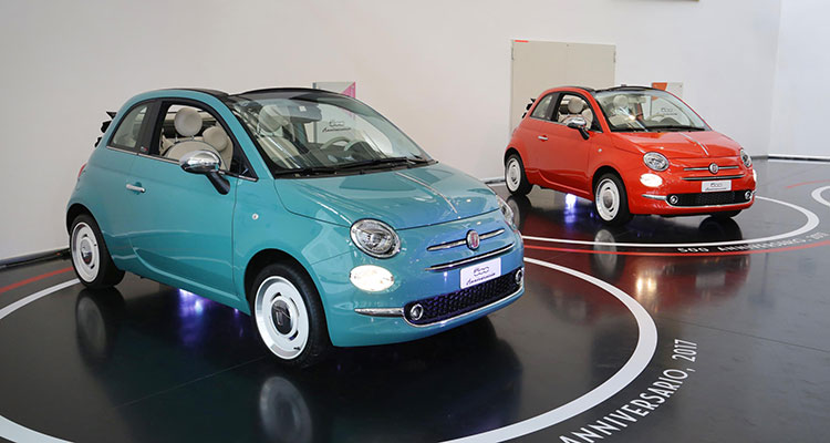
It’s small, it’s fun and it’s quirky. However, on the inside it’s garish, cheap and ridiculous.
A car is usually one of the most expensive items someone will own so why on earth would they want to drive around in something that looks like it came from the toy section in poundland?
Ford Fiesta
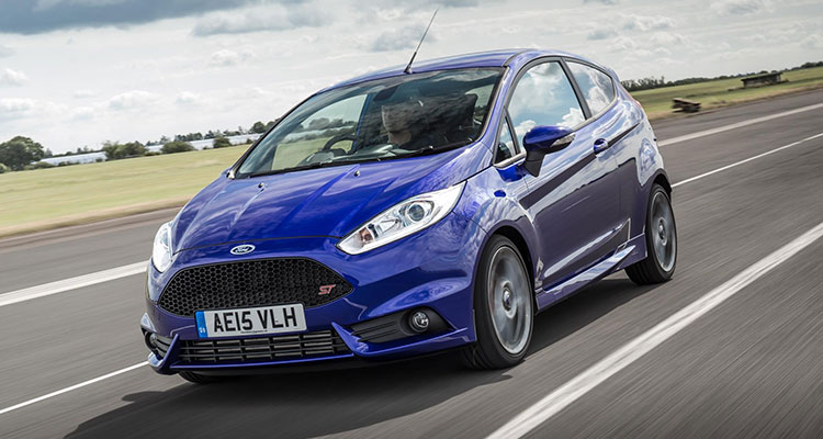
Ford has never really been associated with making sophisticated, luxurious vehicles. Their strength is in making affordable and practical cars for the masses. That being said, the masses should not have to suffer this awful interior.
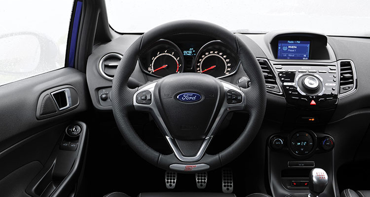
The centre console looks like an Alienware PC from 2005 and somehow, although there aren’t actually that many buttons, Ford has made it look like there’s a million of them. Shiny gloss black plastic, rough plastic and some smooth plastic is all you’ll find inside one of these Fiestas unfortunately.
Toyota Prius
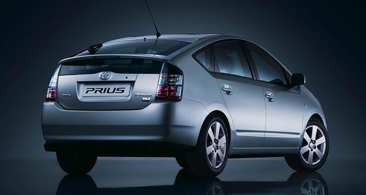
The third-gen Prius (2009-2015) had a drag coefficient that was lower than most supercars. You could even say it was ahead of its time. The same cannot be said for the inside of the car.
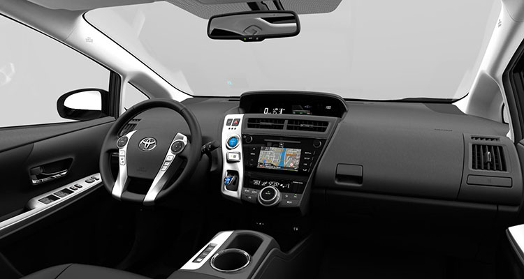
The heads up display that replaced the gauge cluster was pretty cool, you can’t deny that, but the rest of it was pretty poor. The wheel looks like it was chiselled straight out of a block of plastic, the buttons are big and goofy and the passenger has nothing to look at but an expansive abyss of rough, scratchy plastic. Not a good look.
Suzuki Swift
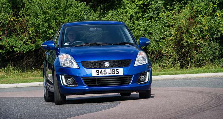
The Swift is a cool hatchback. It’s a great alternative to a Fiesta or a Corsa, especially if you don’t want to blend in with all the other youngsters on the road.
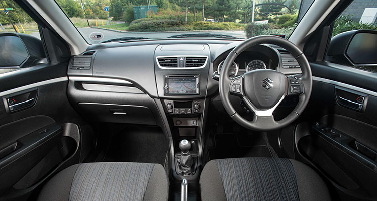
What’s not so cool is the cabin of the Swift. It certainly hasn’t aged well with its patterned fabric seats and soulless centre console. The Swift’s cabin didn’t really try to stand out or express itself in any way and you thought that would make it more timeless, but actually, it just makes it draining to look at.
Nissan GT-R
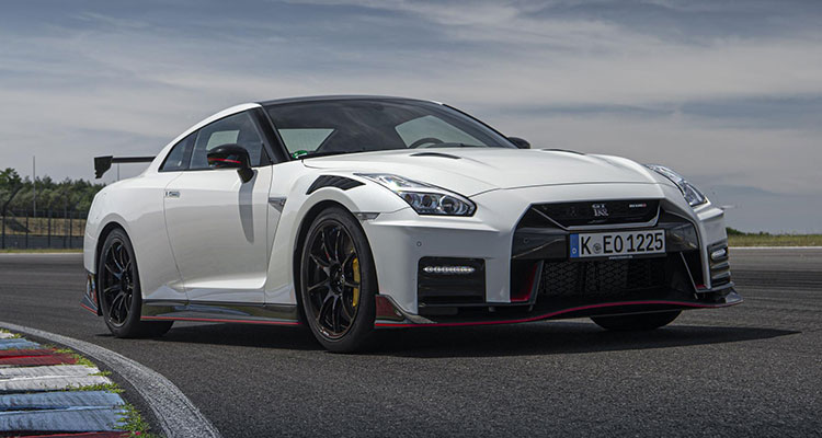
The Nissan GT-R is an incredible car. It’s faster than some cars that are twice the price and it has looks good enough to make a grown man cry. The same cannot be said for the inside of the car.
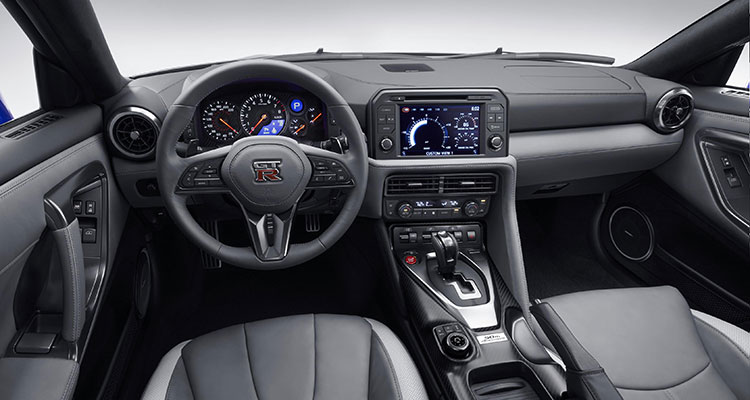
One look at the interior design of this car will have you thinking that we’re still living in the 90s. This especially annoys me because it gives those people who say “it’s still just a Nissan” some credibility to their argument. It drives like a McLaren, it looks as badass as an Audi R8 and yet on the inside, it still feels like a Nissan Qashqai. Why?
Let us know about some interiors that have really stood out to you for all the wrong reasons.
If you enjoyed this you may also enjoy reading about one of the weirdest interiors of all, found in the new Citroen Ami.
For more articles like this, receive our weekly e-newsletter, including partner deals and all things motoring, register your email below.
Please note: You cannot subscribe to Smart-Motoring unless you put a tick in the checkbox below to indicate have read and agreed to our privacy policy.


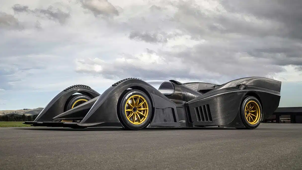
Why is it that so many manufacturers seem to forget about the dashboard aesthetics, it’s seems they have forgotten how to design a decent dashboard & just stuck a touch screen In the middle of the dash – not even intergrating it.